j

Lorem ipsum dolor amet, consect adipiscing elit, diam nonummy.

Follow Us

Search

SureTec

Merging Three Products into One Unified Platform

Summary

Context

An oil and gas SaaS company maintained three distinct yet overlapping products used by the same user base. The objective was to consolidate these into a single cloud-based platform, harmonizing functionality, shared entities, and design into a seamless, cohesive user experience.

My Role

  • Led the strategic consolidation of features, interactions, and data models across the three platforms.
  • Designed the new experience architecture, including navigation patterns and UI components.
  • Facilitated cross-functional workshops with stakeholders, product managers, and engineering teams to identify user needs and technical constraints.
  • Conducted iterative design reviews and usability sessions to refine the product with continuous feedback.

Current Three Products to Merge

I had a deep understanding of the products through redesigning a significant portion of one, designing a beta version of another, and making incremental improvements to the legacy desktop application. This helped me bring all three products together into a single unified platform.

SureTec
SureTec: A desktop application for building and executing test plans, generating reports, and managing digital approvals.
WellSchematic
WellSchematic: A cloud-based web app for creating wellbore diagrams, P&IDs, and visualizing well barriers.
SureView
SureView: A browser-based analytics platform for referencing reports and data insights.

Discovery

I facilitated workshops with stakeholders and the product team to understand user needs and product content. In collaboration with the product team, I mapped out the content structure and relationships.

User Personas

We defined key user types, their goals, and common pain points. This helped anchor our design decisions in real user behavior and business objectives.

User Scenarios

To better understand our users, we created detailed scenarios showing how each persona completes their tasks in real-life situations and the challenges they encounter.

The more context you have around a user’s goals and the problems they face, the better you can help them solve it.

Example of a user scenario

Content Audit

I conducted an audit to identify overlaps, gaps, and redundancies between the three platforms. This informed decisions on what to keep, remove, or combine.

Audit of content to keep, remove, or consolidate

Card Sorting

Using color-coded cards for each product feature, we organized and grouped content into logical categories to clarify structure and content relationships.

Cards for all the content that exists, color-coded by platform.
Cards grouped by asset correlation

Site Architecture

I designed a unified sitemap and navigation structure to ensure a logical flow, proper content nesting, and easy access to related information. I collaborated with product leads to define screen-level content and refine the information hierarchy.

Design

Creative Direction

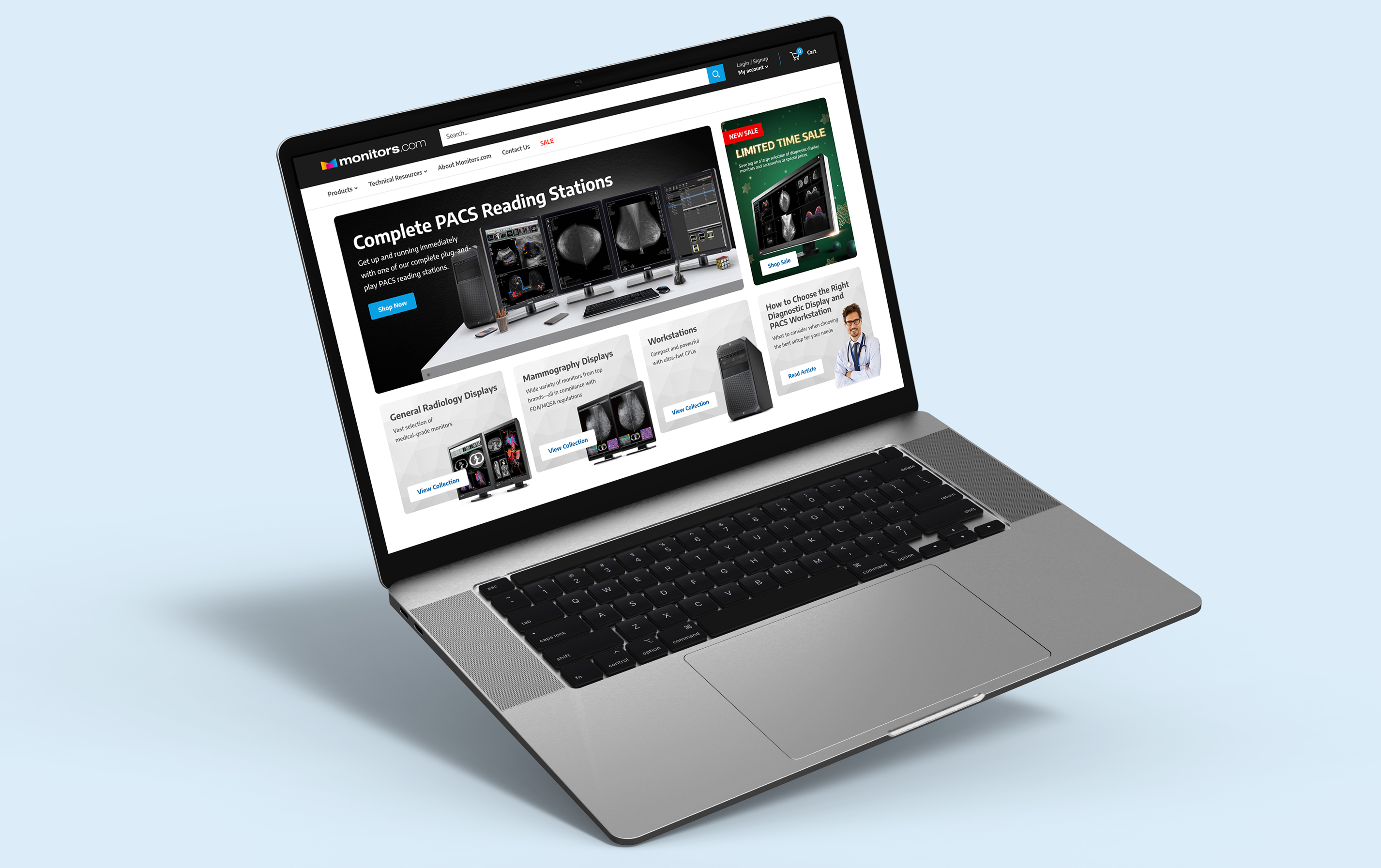
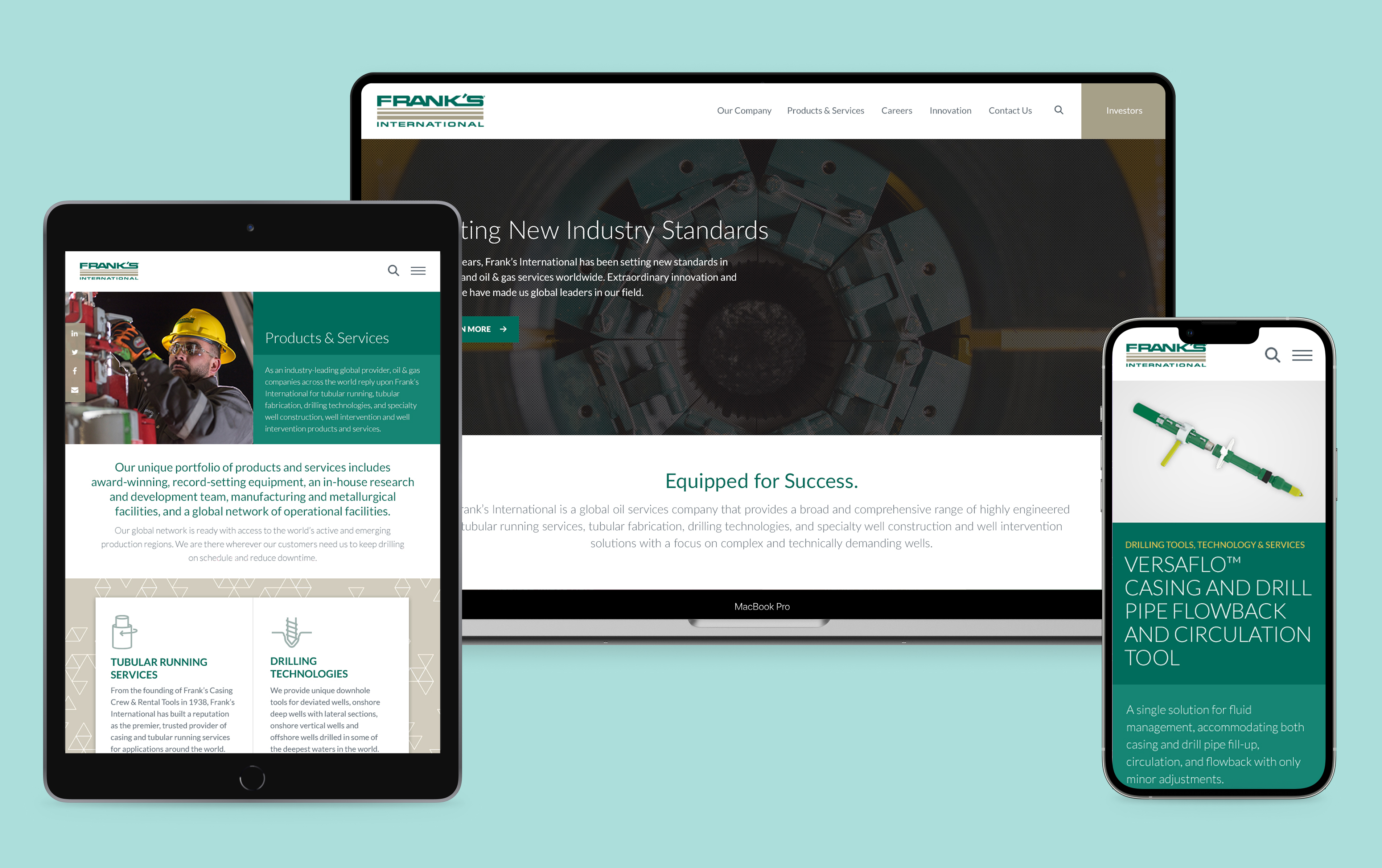
While the three products shared a common brand, inconsistencies in color, typography, and layout created a fragmented experience that diluted the overall identity. I used this as an opportunity to unify and strengthen the visual identity. Building on the existing brand, I created the design to be tech-forward, innovative, and professional. The final look used minimal design, conservative dark blues, and select vibrant brand accent colors to deliver a modern, cohesive feel.

Initial Design Directions

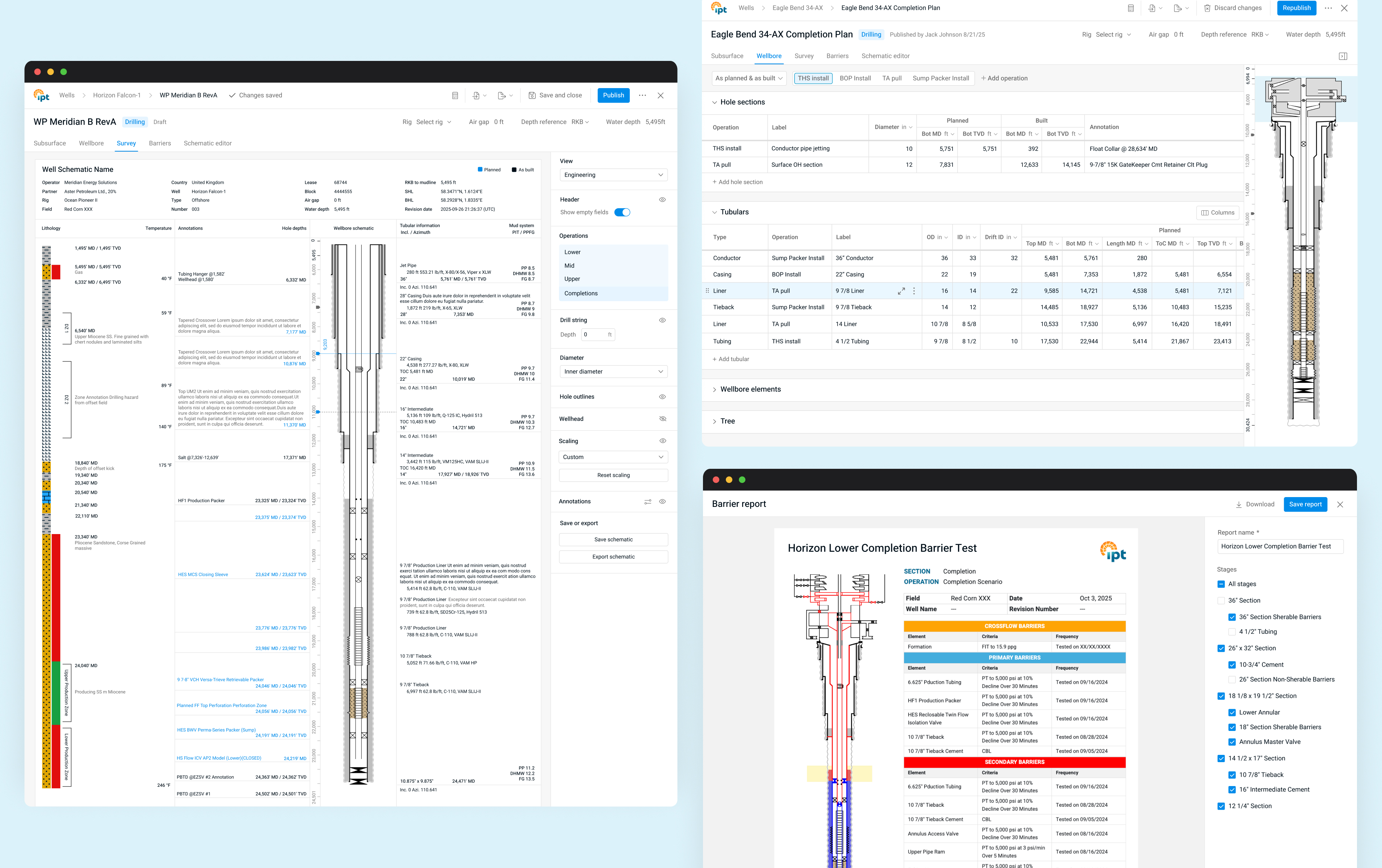
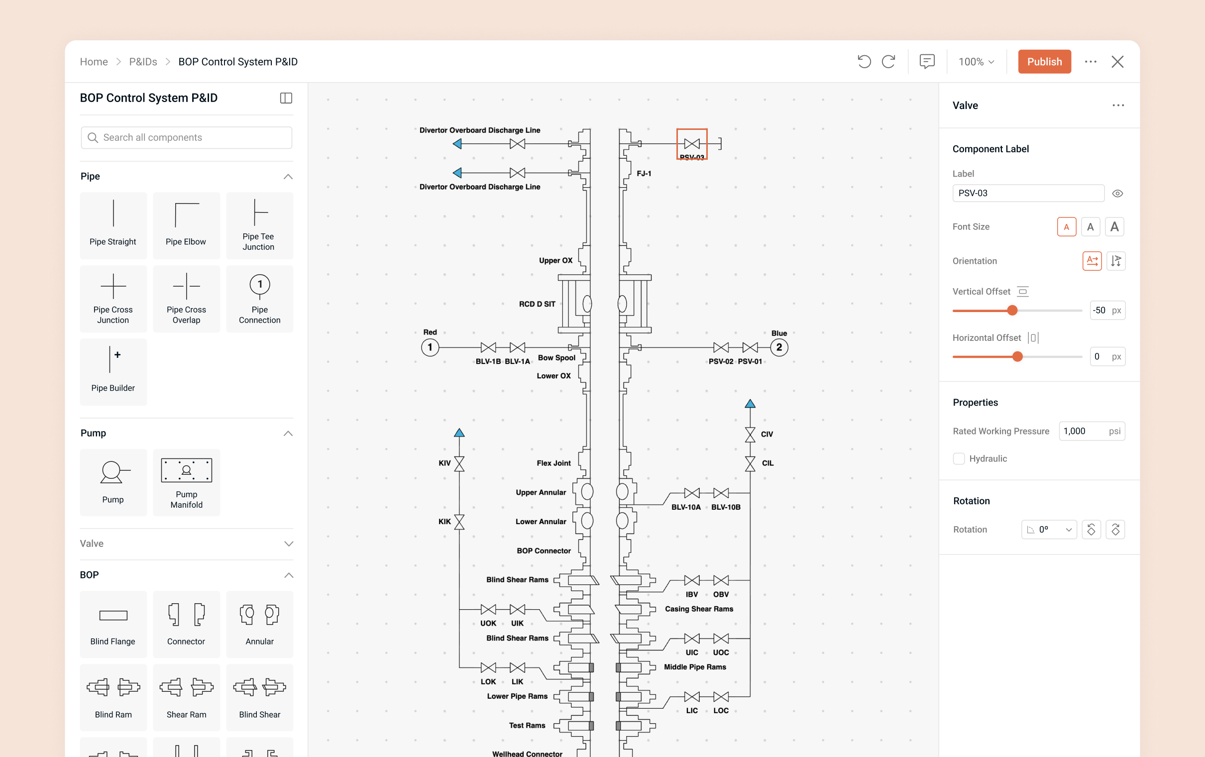
The initial comps were designed to establish a framework that made it easy for different user types to access the content they needed and navigate the platform through thoughtful content linking. They also aimed to enhance the visual identity through navigation, layout, and interactive elements. Additionally, these comps served as a reference point for discussing technical feasibility with the software team and gathering feedback for ongoing refinement.

Iterative Refinement

The design evolved through multiple feedback loops with the product, and engineering teams. I continuously refined the design based on usability insights and technical feedback.

Example of internal team feedback

Final Design

The result was a clean, intuitive, and scalable platform that unified previously disconnected experiences and branding into a single, streamlined interface.

Customizable Dashboard

Different users needed quick access to content relevant to their roles. To address this, I designed a customizable dashboard with widgets tailored to their usage patterns, including a “recently visited” widget for easy access to frequently used content.

Smart Navigation

The navigation unified the high-level product content while making it easy to access nested items through features like recently visited pages, user-created folders, and favorited content. Hovering over a favorited or recently visited item displays a thumbnail preview, helping users quickly identify each item.

Expanded Access to Favorites and History

In addition to the navigation, users could view an extended list of their favorited or recently accessed items, making it even easier to get back to relevant content.

Nested Content

Users can access specific wells or rigs through a filtered table view. Content from the various platforms was consolidated, and all the related information for each well or rig is displayed through organized tabbed navigation—making it easy to explore everything within a single, structured interface.

Easily Accessible Content

I implemented side panels that let users view or interact with content without navigating away from their current page or task. These could be expanded full-screen and provide navigation to more associated content.

An example of an approval workflow opened from the approvals tab associated with a specific well.
An example of a test opened from the all tests table with tabs to access the related content.

Enhanced Reporting Features

Based on user feedback, I redesigned the well report feature to include more content options and a smoother process for adding and reviewing report elements.

Settings

Settings were designed to be clear and user-friendly, allowing users to easily manage their personal preferences, team settings, and organization-level configurations.

Outcome

The project delivered a cohesive, cloud-native platform that replaced three siloed products into a unified experience—improving usability and efficiency. The final design is scalable and boosts the brand’s visual identity.